Derek Ratliff wanted to be THE Amarillo Handyman. The name speaks for itself. Amarillo Handyman is based out of Amarillo, TX. The owner? A hardworking gentleman whose aim was to create a business that stood out amongst the competition, providing excellent service by a professional.
Logo System
Typography, Color
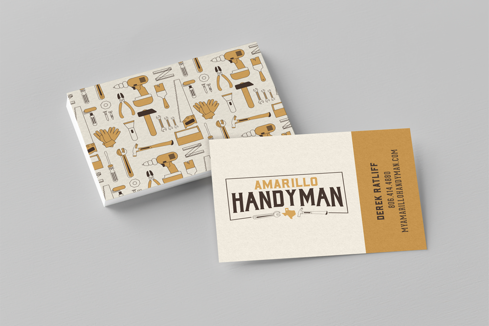
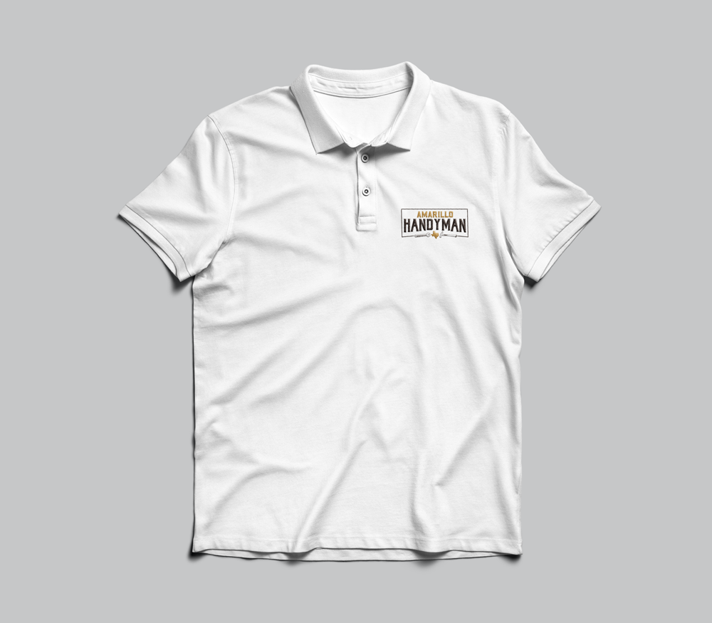
Business Cards
Apparel Design
Visual Identity Goals
Easy to identify – know what is being offered when looking at the logo
Stand out from local competitors
Professional
Emphasis on local – Amarillo
Target Audience
Stay-at-home moms
Small businesses
Those less agile
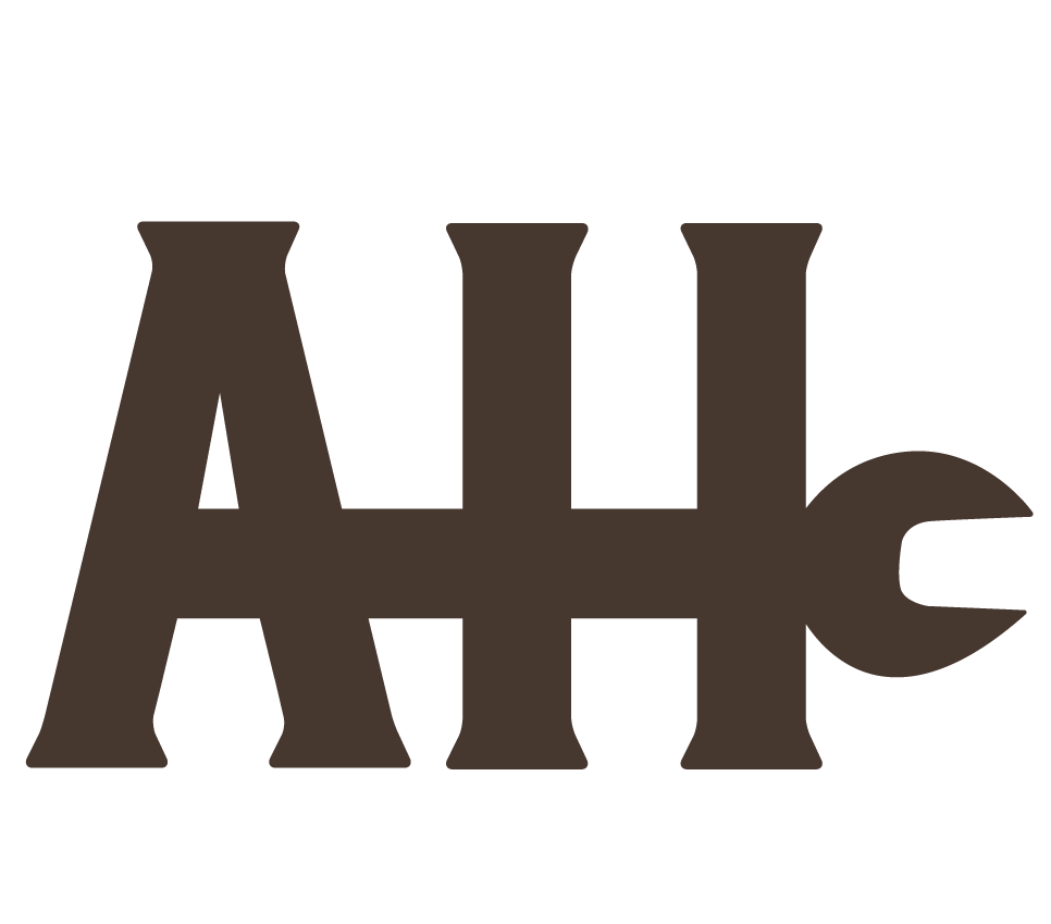
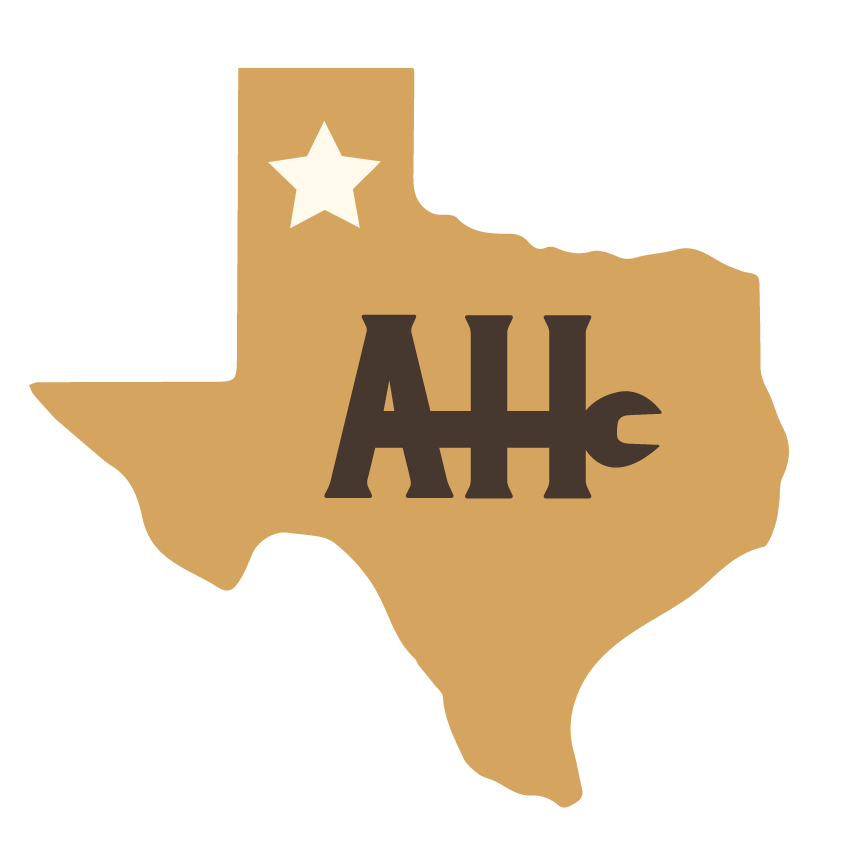
Logo
Wordmark
Favicon
Color and Type
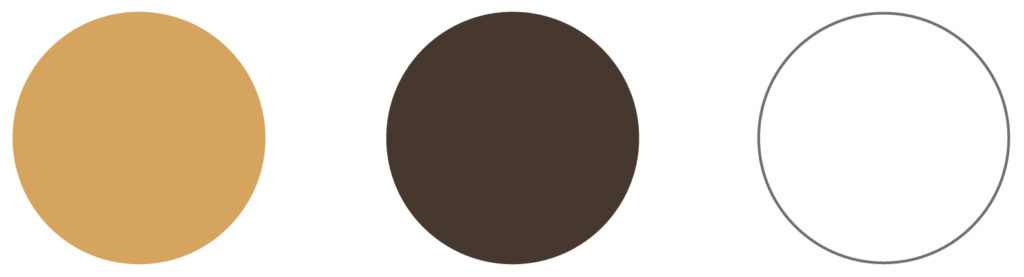
Color:
Representative of Amarillo
Gold – Amarillo is Spanish for yellow, but let’s be honest yellow is a little atrocious when it come to logo design so we went with gold
Brown – Representative of the flat plains of the Panhandle, rust, tools, a more masculine color
White – Clean. Creates negative space but also illustrates the idea of things being made new; back to its original state.